

This page demonstrates the capabilities of the content editor interface of this website. Editors can take a peak behind the scenes to see how this page was edited. Please take care not to edit or delete this page. If you want to try something in a sandbox, check out the test website.
Other resources for editors of this website can be found on the Dashboard.
Need help or have questions? Contact the COFA Web Team.
Before starting, familiarize yourself with the infrastructure, requirements and writing for the Web best practices.
Web Content Requirements
Voice, Tone, and Branding
The most important first step to establishing proper tone and branding is an open communication with your own school or department's public relations office.
Layout Builder
Learn how to use Layout Builder to edit Flex pages and other Content Types that use Layout Builder to create layouts with columns, sections and block as demonstrated by this page.
Block Types
Blocks can be created as Reusable Blocks, allowing content to be created once and used on many pages!
- Feature Content Blocks
- Basic Block & All Body Fields with a Rich Text Editor.
- A Two Column Layout, Accordion/Hide Reveal or Tabs
- Blocks for Images
- Grid and Float Layout Alignment Blocks
- Menus, Navigation and Way-finding Blocks
- Listing Blocks for News, Profiles or Events are also available.
Hero & Feature Content
For most images in the Feature content Block types the recommended upload image width is 2280 pixels. Minimum recommended image width is 1600 pixels. Suggested size is 2280x1132 pixels. The actual display size and ratio are variable and change on device window size and depend on selected cropping choice. Always pre-optimize images that are larger than 1MB and review on different screen sizes.
Page Title H1 Tag
Every page must have a single H1 Heading tag. The homepage is coded with a hidden H1. The page Title field is the H1 for all other pages but must be turned off when the Heading 1 (H1 tag) Hero or the Ambient Video with H1 Headline option are used. Learn how and find other instructions for Featured Content Blocks on our instruction site.
Heading 1 (H1 tag) Hero
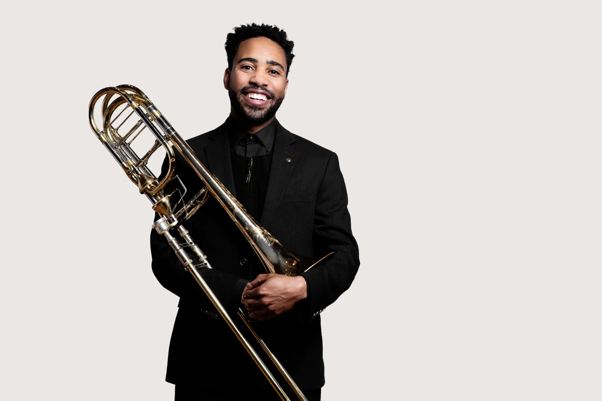
caption credit
caption credit
Select image that will ensure the text is legible and contrast complies with ADA requirements. Credit
Carousel
Auto play is discouraged
Caption Credit
Ambient Video
Gallery
Header text area

Media copy text area.

Copy area for caption of image.


Below demonstrates Blocks added into a Section that is 2 Columns (50%, 50%).
Basic Block & All Body Fields
To format and style text and media in Body fields use the Rich Text Editor buttons .
Format Drop-Down
From the Format drop-down, you can turn your text into Headings. Headings automatically create an anchor that you can use as a jump link to another spot on the page. Headings need to be hierarchical and accurately represent the outline of the page. Use lots of keywords in your headings to optimize for search engines. Be aware that every page must have a single H1 Heading tag. The homepage is coded with a hidden H1. The page Title field is the H1 for all other pages, unless in Layout Builder the Heading 1 (H1 tag) Hero or the Ambient Video with H1 Headline options are used. Fields in Layout Builder Blocks may also display as headings, usually Heading level 2. Also, you can apply emphasis, strong, smaller, bigger and cite to headings and you have a set of variation styles to apply, which can be found in the Styles drop-down.
Heading 2
Heading 2 Variation
Heading 3
Heading 3 Variation
Heading 4
Heading 4 Variation
Heading 5
Heading 5 Variation
Heading 6
Heading 6 Variation
Paragraph variation style
Styles Drop-Down
- Apply the stylistic variations to Headings and paragraphs, demonstrated above.
- Insert visually styled Bigger Text or Smaller Text inline or as a paragraph without any semantic meaning. The paragraph options adjust leading / line-spacing.
- Insert a Side Comment text representing fine print, like copyright and legal text.
- Insert text with emphasis or strong to indicate importance.
- Insert visually styled italic or bold text with no semantic meaning. Use cases for this are uncommon.
- Indicate inline quotations with semantic meaning. See also the Block Quote button option, below.
- Indicate the title of a work, publication or performance with the Cited Work option. Eg.Hamlet.
- Hide content from the visual display to provide more context to Google, screen readers, and other non-visual displays.
- Clear float, which is useful for aligning images next to text in the Body field.
- Steps to create hide-reveal accordion content include tools in the Styles Drop-down.
Other Rich Text Editor Buttons
Block Quotes for set apart pull quotations. See also inline quote in the Styles Drop-Down, above.
And horizontal rules:
For the following horizontal rule style, insert the Reusable block, "DESIGN: horizontal Rule | orange." In a Rich Text field <div class="alternative"><hr></div> will be stripped out, but if you have other content in the div it will work, something like:
<div class="alternative"> <p>Some content</p> <hr> </div>
Basic Body & Rich Text Editor - Continued
Link Button
Since website visitors, search engines, screen readers and other technologies all rely on links, the text used for links and link appearance are critical. Once a page is published we do not recommend changing the Universal Resource Locator (URL) path for the page. The Link button will popup an interface where you can:
- enter an entire Universal Resource Locator (URL) for an external website, an email addresses to create a mailto link,
- start typing the page title or file name and autocomplete will help find internal content, sorted by type, on the current site to link to,
- you can also turn a link into a Primary Button or Secondary Button
- use the ARIA label to provide more contextual information about your links for Google, screen readers, and other non-visual displays,
- add icons to indicate that a link requires a login and
- create a link that opens in a new window/tab. If you do, be sure to add the External Link icon.
Tables
Data tables require special steps to be accessible and responsive. Follow these instructions carefully. You must create tables with the Rich Text Editor button and you must include a caption and select a Header Column and/or Row. For a simple two column grid the default Flex List Block or a simple 2 column Description List may be a better option.
| Required Header Column | Second Column Header |
|---|---|
| Data cell 1 | Data cell 2 |
| Data cell 3 | Data cell 4 |
| Data cell 5 | Data cell 6 |
Images & Multimedia in Rich Text Fields
Many of the Block Types in Layout Builder, especially the Photo Content Area and Image Link Block are great for adding images but you can also add them into any Body field. See how to instructions for images in the Body and learn how to adjust the size, caption and alignment. The maximum recommended image width is 2500 pixels wide. See instructions for how to add multimedia including some embeddable content.
Embeddable Content, like Forms
Qualtrics forms and some other embeddable content must be requested, contact the Web team.
HTML Source Code
Use the Source button to edit code for the following functions. After completing your edit, toggle out of the Source interface to review in the WYSIWYG before hitting save or your edits may be lost.
- Abbreviations and foreign languages should be indicated with edits in the Source code.
- Control where long words break in narrow columns. This is particularly important to check for on some small screen sizes.
- Left & right image alignment (includes how to create multiple rows of content with floated images)
- Fix for word wrapping in narrow columns
- Hide on desktop or hide on mobile
- Add non-visible link context
- Add tags to text only fields that do not have a Rich Text editor.
- Full list of available tags and more tips
- Create a simple 2 column Description List or Hide/Reveal Accordion when you can't use the Flex List Block.
Hide-Reveal or Accordion in a Basic Body Block
You can use the Source button to create a simple 2 column Description List or Hide/Reveal Accordion in a Body field when you can't use the Flex List Block.
Flex List
- Description List Heading DL tag
-
The Description Details in the DT tag. Any content that can go in a Basic Body Block can go in this content area, including images, video and other media.
- Item 2 Header
-
Default display is a semantic description list. View mode options: "Accordion", "Horizontal Tabs" or "Mobile Accordion, Desktop Tabs"
Flex List Accordion
Item Header Summary Tag
Item 1 content
Should I Use Accordions?
Consider carefully the pros, cons and best practices of using Accordions.
Flex List Horizontal Tabs
Consider carefully the pros, cons and best practices of using Tabs. Tabs automatically create an anchor that you can use as a jump link to another spot on the page.
Content 2
Below demonstrates Blocks added into a Section that is 2 Columns (33%, 67%).
Image Link Custom Block

The easiest way to add an image that is a link is to use the "Image Link" Custom Block. Recommended upload image size is 1800 pixels. Maximum recommended image display width is 900 pixels wide.
Photo Content Area

Single image with text either next to it or below it (stacked). No CTA. Can have a links list.
Recommended upload image size is 1800 pixels. Maximum recommended image display width is 900 pixels wide. COFA sites do not crop the image to a 3:4 ratio.
Photo Content Area Variation 1
PHOTO CONTENT AREA Variation 2
Promo Unit

Item Headline H3 tag
Usually multiple items. Can be image with text either next to it or below it (stacked). Choose either landscape, portrait or square. Limit the number of items per row for largest screen size. Can have a link with each item or link the Headline. Does not have CTA. COFA sites display slightly larger images.

Item 2
11:7 ratio image. Recommended upload image size is 660x400 pixels. Maximum recommended image display width is 330 pixels wide.
Promo Unit Variation 1

Item 1
Copy Here

Item 2
4:5 ratio image. Recommended upload image size is 450x600 pixels. Maximum recommended image display width is 300 pixels wide.
Promo Unit Variation 2


1:1 ratio image. Recommended upload image size is 500x500 pixels. Maximum recommended image display width is 280 pixels wide.
Photo Content Area & Promo Unit Custom Blocks have a side-by-side option, where the text is displayed beside the image as demonstrated above or a stacked version, where the image is above the text, that is demonstrated at the bottom of this page.
Below demonstrates Blocks added into a Section that is a 100% Container Width.
Flex Content Area

Headline H3 tag
Usually multiple items. Content is always stacked. Can be text, images, list of links, CTA or any combo. Can have a button with each item or link the Headline.

Headline 2
3:2 ratio image. Recommended upload image size is 1000x666 pixels. Maximum recommended image display width is 900 pixels wide.
Flex Content Area Variation 1


Flex Content Area Variation 2
Content fields in the Custom Block types are optional. You can use the Block types to experiment for edge case layout solutions.

Headline
Item 4
The Copy field in most Custom Blocks can be set to use the Flex HTML Text Format, which allows you to do everything that you can do in the Basic Body Block, including adding images, media or accordions. This flexibility could be helpful but proceed with caution and please carefully review on all screen sizes.

Stacked version of Promo Unit and Photo Content Area work well in narrow columns. Compare them to Flex Content Area and Image Link below.
Below demonstrates Blocks added to a Section that is 4 Columns (25%, 25%, 25%, 25%)
Photo Content Area Stacked
Promo Unit Stacked

Item 1
Copy
Item 2
Flex Content Area
Item 2
Block Quotes for quotations
Image Link
Quick Links Variation 1
Styled like Main Navigation but is manually populated and does not disappear on mobile.
Contents
Quick Links Variation 2
Intended to be used as a Table of Contents jump link menu on long scroll pages. Please read about linking to another spot on the page.The menu must have a title of "Contents" so you can include "Back to Contents" links below each content area, using the reusable Custom Block.
Menus & Navigation
Consider carefully and follow instructions for Navigation, Menus, Paths & Links. You will find links to edit this sites Main Menu Navigation, Footer and Header Menus on the dashboard.
Main Navigation Secondary Menu Block & Mini-site Sidebar Menu Block
Main Navigation Custom Block - Demonstrated on the right. It is advisable to use the Main Navigation Custom Block to add a secondary menu block to most pages. If configured properly, the menu should be automatically populated with the correct child and sibling pages for the appropriate section of the site, so that you do not have to manually edit every page when menu items change. This block type does not display on mobile when the mobile menu becomes visible.
Mini-site Sidebar Menu Blocks can be added following the same configuration instructions as the Main Navigation Custom Block. The items in this block type do not display in the Main Navigation on desktop or mobile. Therefore, this block type does display on mobile.
- Add a Section with a 25% width column for the navigation.
- Add the Block, "Main navigation"
- Configure it
- Check the box to "Display title".
- Set the "Initial visibility level" to match the page level in the Main navigation, usually 1.
- The "Number of levels to display" is usually unlimited.
- Usually, do not check the box to "Expand all menu links"
- If you want the children of sibling menu items to display, check the "Expand all menu links" box
- If the parent is a <nolink> label you will have to expand the menu items.
- Select the top level parent item that this page is a child of from the "Fixed parent item" dropdown.
- From the "Use as title" dropdown, select "Fixed parent item's title"
- Check the box "Link the title?"
- You should not need to set any other configurations.
If you have any issues, please see the troubleshooting tips or contact the web team.
Duplicate Link Text
This site appends visually hidden text to menu items if you enter it into the "Description" field in the menu item creation form interface. If you have two menu items with the same visible link text, please enter additional contextual text into the "Description" field. Learn more about the importance of unique clickable text.
Quick Links Block
Also demonstrated on this page is the Quick Links Block. It can be used to mimic a Secondary Menu or make a Table of Contents jump links menu.
Quick Links
Allow you to add additional helpful links to your page with the choice to display links in lists up to 4 columns.
Below demonstrates a Readable Width Block added to a Section with background color that is Full Width of the page.
Tip: Combine Variations of the Custom Block Types that have the same background color, to create unique combinations.

Photo Content Area
Variation 2
Below demonstrates a Blocks added to a Section that is Full Width of the page.
Additional Tips
Some of these links go to older instruction with screenshots that might not look quite right but, with that understanding, the information should still be helpful. We'll be getting it all updated asap.
- Buttons in the Rich Text editor
- Create a Link
- Telephone Links
- Great Links
- Source Code, HTML
- Great Headings
- Acronyms & Abbreviations
- Foreign Languages
- Documents, files, Word, PDF
- Long word wrapping
- Menus, Navigation & Paths
- Responsive Web Design, Large & Small Devices
- Site Search
- Clearing the browser cache or memory
- Content Management System Infrastructure
- Test site, Sandbox
- Media (Images, Documents & Videos) Management
- Analytics & Visitor Data
- Increase traffic, visitors
- Evaluate & Test webpages
- Alternate Text descriptions
- Use of Color & Color Contrast
- Captions, Audio Description and Transcripts
- Hide on Mobile or Desktop